Product Case Study • 2025
Fixing Scroll Drop-Offs to Unlock Enquiry Growth
A data-led redesign of a high-traffic student accommodation property page to reduce early drop-offs, surface decision-critical content sooner, and improve enquiry intent through better information hierarchy and page flow.
Role: Product Designer (acting Product Owner)
Platform: Web
Status: Live (2nd Feb, 2026)
Context
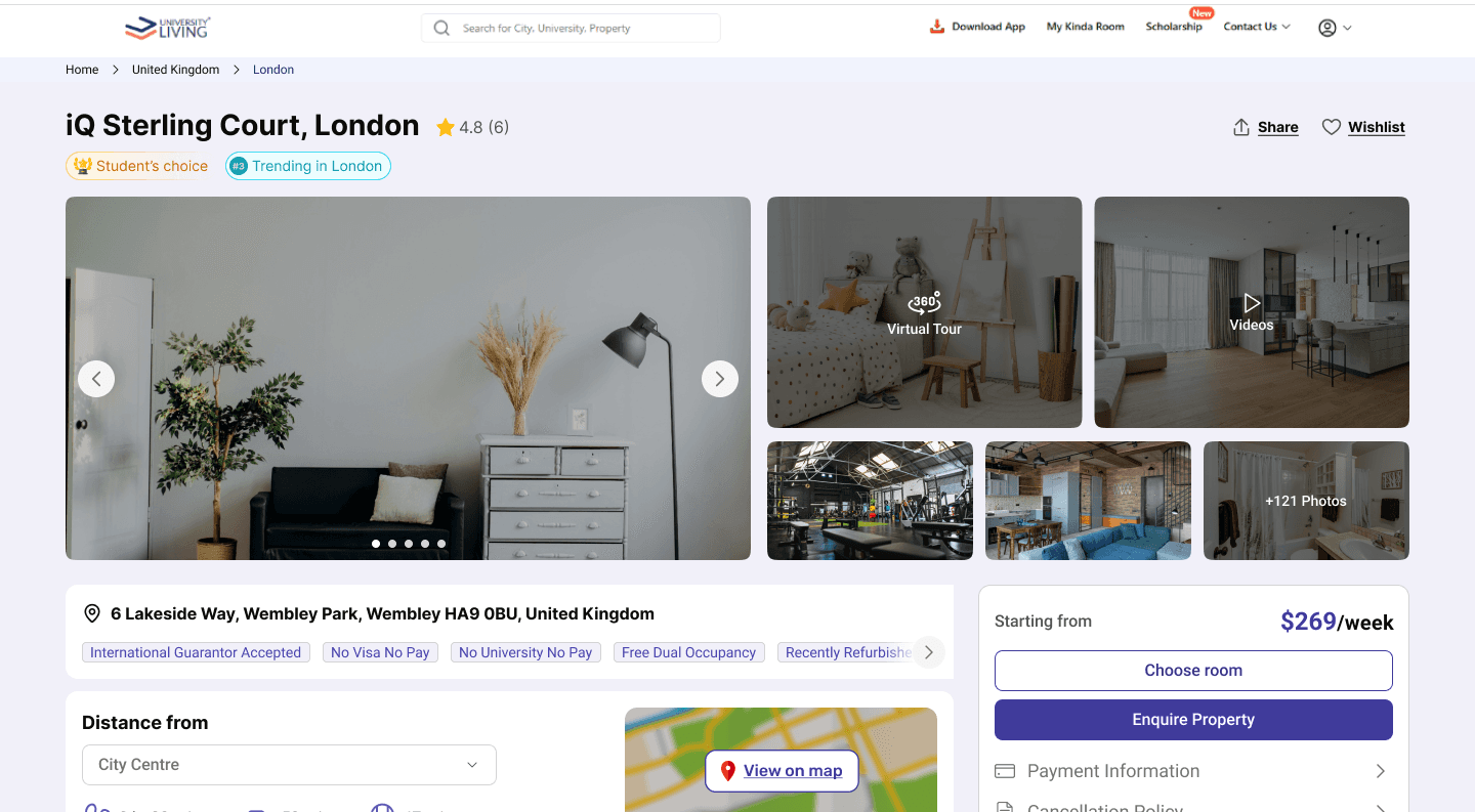
University Living helps international students discover student accommodation and raise enquiries — not complete end-to-end bookings.
The Property Detail Page (PDP) plays a critical role in helping users understand availability, compare room options, and decide whether to enquire. Despite high traffic, the page showed strong initial engagement but weak progression, limiting how many users reached high-intent sections.
Data showed that users were engaging with the page initially but dropping off early. The second fold consumed valuable screen space without offering clear value, and most users scrolled past it quickly or disengaged altogether.

+50%
Scroll depth improvement till Room Types
1.3x
Increase in CTA clicks
-41%
Bounce rate reduction
–36%
Time to decision
Problem Identification
Through heatmap analysis, session recordings, and user interviews, I identified critical structural and behavioral issues that were fundamentally undermining the page's effectiveness:
Low scroll depth across the page
User engagement was heavily concentrated on the first fold. While initial interest was strong, a significant portion of users did not progress meaningfully down the page.
Second fold provided limited actionable value
Despite occupying prime screen space, the second fold did not contribute to decision-making. Users scrolled past it quickly, indicating low relevance and weak information payoff.
Early drop-off before high-intent sections
~75% of users reached the second fold, but only ~50% reached the Room Type section — the area where user intent was strongest and time spent was highest.
High-intent content buried too late in the journey
Room Types and key decision details were placed lower in the page hierarchy, making them inaccessible to a large segment of users who could have converted.
Problematic container behaviors
Long descriptions expanded inline, pushing all content below it down and disrupting the user's mental model. Every click on ‘red more’ was a punishment.
Unstructured UI actions competing for attention
Wishlist, compare, breadcrumbs, and secondary actions lacked clear hierarchy, increasing cognitive load and diluting focus from the primary enquiry journey.
Missing trust factors
Verification badges, owner credibility indicators, and safety information were absent, creating hesitation at the moment of conversion.
Approach & Thinking
1. User Intent Mapping
Instead of starting with the existing layout, I mapped the user's decision-making journey. What questions do they need answered, in what order? This revealed that users follow a mental model: Overview → Key Details → Trust Validation → Action.
Key insight:
Users weren't scrolling deep because the first 2 folds didn't give them a reason to. If critical information isn't surfaced early, they assume it doesn't exist.
2. Information Architecture Audit
I conducted a comprehensive content inventory, categorizing every element by user value and frequency of reference. This data-driven approach allowed me to prioritize what deserves prime real estate versus what can be secondary or on-demand.
Content prioritization framework:
Tier 1:
Decision-critical (price, location, photos)
Tier 2:
Decision-supporting (amenities, trust factors, offers & discounts
Tier 3:
Supplementary (full description, reviews, similar properties
3. Fold Strategy Rethinking
Rather than accepting traditional fold structures, I analyzed actual viewport data across devices to understand real estate constraints. Then designed a progressive disclosure strategy where each "fold" provides enough value to encourage the next scroll.
First Fold
Gallery + Distance & Travel Details
Second Fold
Amenities + Offers + Trust Factors
Third Fold+
Room Info + Reviews + Related Properties
4. Container Behavior Redesign
I challenged the default assumption that content should expand inline. For long-form content (property and room descriptions), implemented modal-based progressive disclosure. This preserves the page structure and user's scroll position while still providing access to detailed information.
Design principle:
The page should never reorganize itself based on user interaction. Stability builds confidence; chaos creates friction.
5. Trust Layer Integration
Introduced a "trust layer" near the title of the page: verification status, response time, booking protection, user ratings. This isn't decorative-it directly addresses the anxiety users feel before taking action with unfamiliar parties.
🔥 Trending in {city}
⚡ 24/7 support
🛡️ Safe booking/refunds
6. Space Optimization Framework
Applied a systematic approach to whitespace: each gap must serve a purpose (visual breathing room, content separation, or emphasis). Removed decorative spacing, tightened vertical rhythm, and used spacing strategically.
Solution Implementation


Restructured Information Hierarchy
Reordered content to match user intent, surfacing high-value details earlier and grouping related information into clear sections for faster scanning.
Optimized Vertical Space
Removed low-value whitespace and tightened layouts so more users could reach decision-critical sections like Room Types within fewer scrolls.
Implemented Modal-Based Content
Long descriptions, full amenity lists, and detailed policies now open in modals. Page maintains structural integrity while users can dive deep when needed. "Read more" triggers overlay instead of inline expansion.
Integrated Trust Indicators
ntroduced property badges and contextual insights near key decision points to reduce hesitation and build confidence.
Fixed Structural Issues
Corrected container behaviors that had been problematic: standardized padding, fixed inconsistent spacing, aligned grid systems, and established predictable interaction patterns.
Results & Impact
Before
Engagement Metrics
Sessions
6,937
Pages per session
3.22
Avg. scroll depth
40.4%
Active time on page
2.5 min
Users reaching Room Types
~25%
Quick backs
14.29%
Rage clicks
0.78%
Dead clicks
14.11%
After
Conversion Metrics
Sessions
12,163
Pages per session
1.98
Avg. scroll depth
43.4%
Active time on page
1.6 min
Users reaching Room Types
~50%
Quick backs
6.18%
Rage clicks
0.31%
Dead clicks
11.42%
Business Impact (3 months post-launch)
yet to be measured*
Key Learnings
Hierarchy beats completeness
Users don’t need all information early — they need the right information early. Moving high-intent content (Room Types) one fold up increased reach without increasing total content.
Scroll depth improves when value is staged
Users scrolled deeper not because the page was shorter, but because each fold clearly justified the next. Progressive value reduced early drop-offs and quick backs.
Trust works best when it’s contextual
Badges like “Student Favourite” and “#3 in London” influenced behavior only when placed near decision points, not when isolated or generic.
Speed of decision matters more than time spent
Average time on page decreased, yet conversion actions increased — confirming that efficient decision-making is a stronger success signal than prolonged engagement.
What's Next
Phase 2
Refine Intent-Based Signaling
CTAs based on user signals (new vs returning to reduce decision time further.
Phase 2
Room-Type Level Optimization
Test pricing visibility, availability cues, and trust signals within room cards to improve selection-to-CTA conversion.
